
riley sheehey
Riley Sheehey is an accomplished and highly sought-after watercolor and multimedia artist. She creates whimsical illustrations and hand-painted objects that infuse joy and beauty into everyday life. Riley's studio specializes in surface design showcased through her eponymous line of textiles and wallpaper, as well as an array of notable collaborations. When Riley approached me about branding in 2020, she had yet to expand her business into textiles and wallpaper. She desired a brand identity that was classic and feminine with a touch of whimsy, reflecting her distinct style, and capable of evolving as her artistic career reached new heights.
Creative Process
The challenge of crafting a brand mark for another artist required a thoughtful approach to complement rather than compete with Riley’s distinctive whimsical style. To begin the creative journey, I delved into Riley’s portfolio and her inspirations, including Claude Monet, Laura Ashley, and Ludwig Bemelmans. Knowing the Lily of the Valley was significant to Riley, I explored the ethereal nature of the flower through a series of sketches. The historical significance of this flower in creating green pigment for paint added a meaningful layer to the design. I chose a vibrant green to complement her signature palette of soft pinks, mints, and dusty blues while also ensuring the brand mark stood out. To honor Riley’s Irish roots, I incorporated clovers into the design, adding a personal touch. The final brand mark was hand-drawn and inspired by block-print textiles, reflecting the patterns that often inspire Riley’s work. Including Riley’s initials
the identity
The culmination of this creative collaboration is a classic brand identity that harmoniously encapsulates Riley Sheehey’s unique artistic style and vision. The bespoke mark, featuring the Lily of the Valley, symbolizes the delicate and whimsical nature of Riley’s work. The bold green hue, reminiscent of the flower itself complements Riley’s beloved soft colors, ensuring the mark stands out on collateral and packaging without clashing. The hand-drawn, block-filled style echoes the block print inspirations in her art, providing a cohesive and timeless representation of Riley’s brand. The brand mark is finished off by an interlocking monogram of Riley’s initials surrounded by the lilies and clovers. This identity not only highlights Riley’s expertise and passion for her craft but also serves as a timeless symbol of her artistic journey and the joy her work brings to others.


deliverables
Visual Identity
Printed Collateral
Website
credits
Mary Margaret Smith, photography
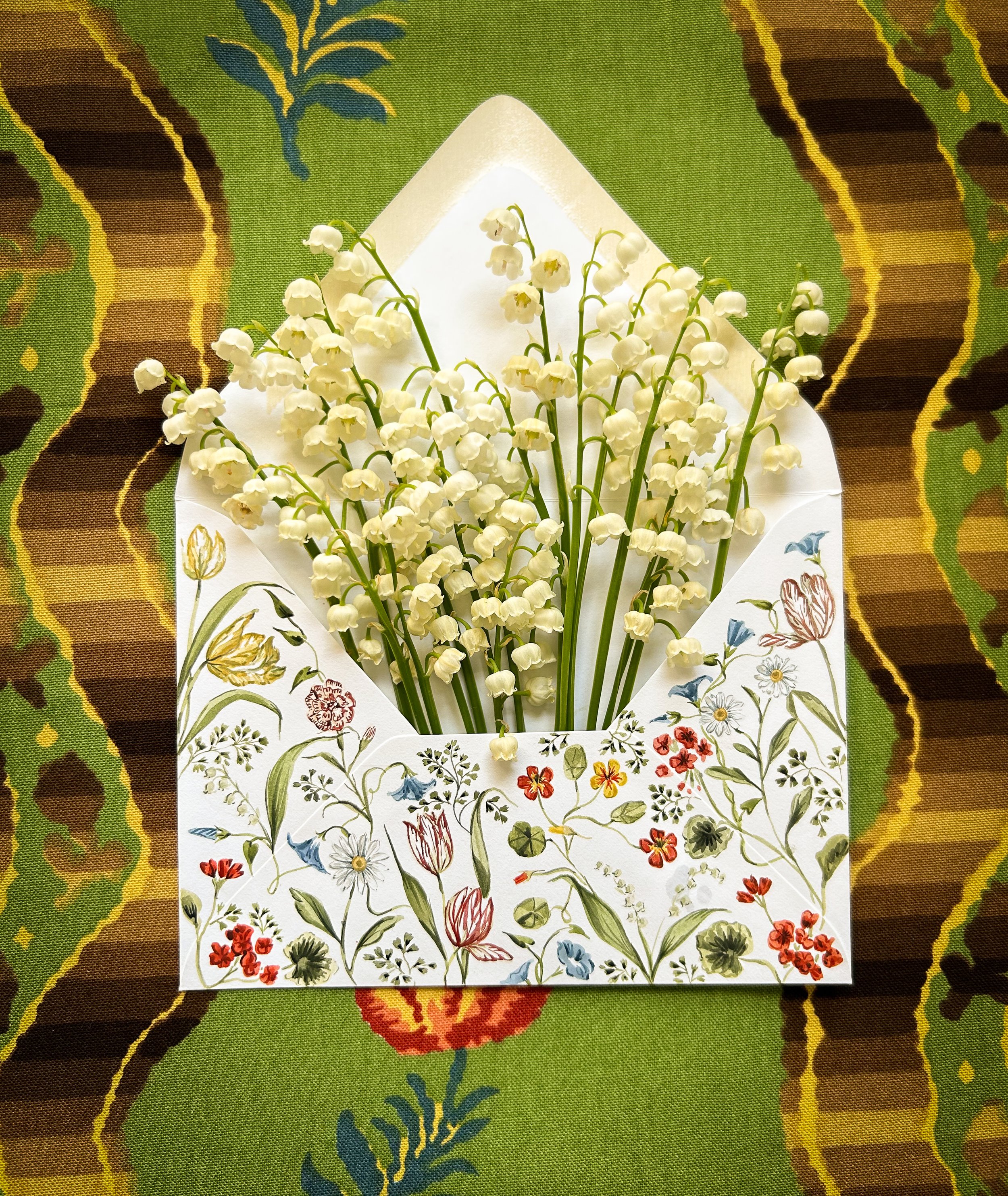
Riley Sheehey, image of envelope with lilies
Kind Words
“I hired Holly for my branding for my fine art and textile business in 2020, and I couldn’t be more grateful to her for designing a logo that has grown with me and my business. I love my logo even more today than I did four years ago- a true testament to her artistry!” -Riley Sheehey

