
ALLISON SHAW REAL estate
Allison Shaw is a dedicated real estate agent serving the Over the Mountain community in Birmingham, Alabama. With a vision to stand out in the crowded real estate market, Allison sought a brand identity that would elevate her business and challenge the negative stereotypes often associated with realtors. She aimed to transform her practice into a full-service boutique, emphasizing her commitment to helping clients navigate the home buying and selling process with minimal stress. Her goal was to create a brand that was clean, recognizable, and reflective of her deep dedication to client service.
the creative process
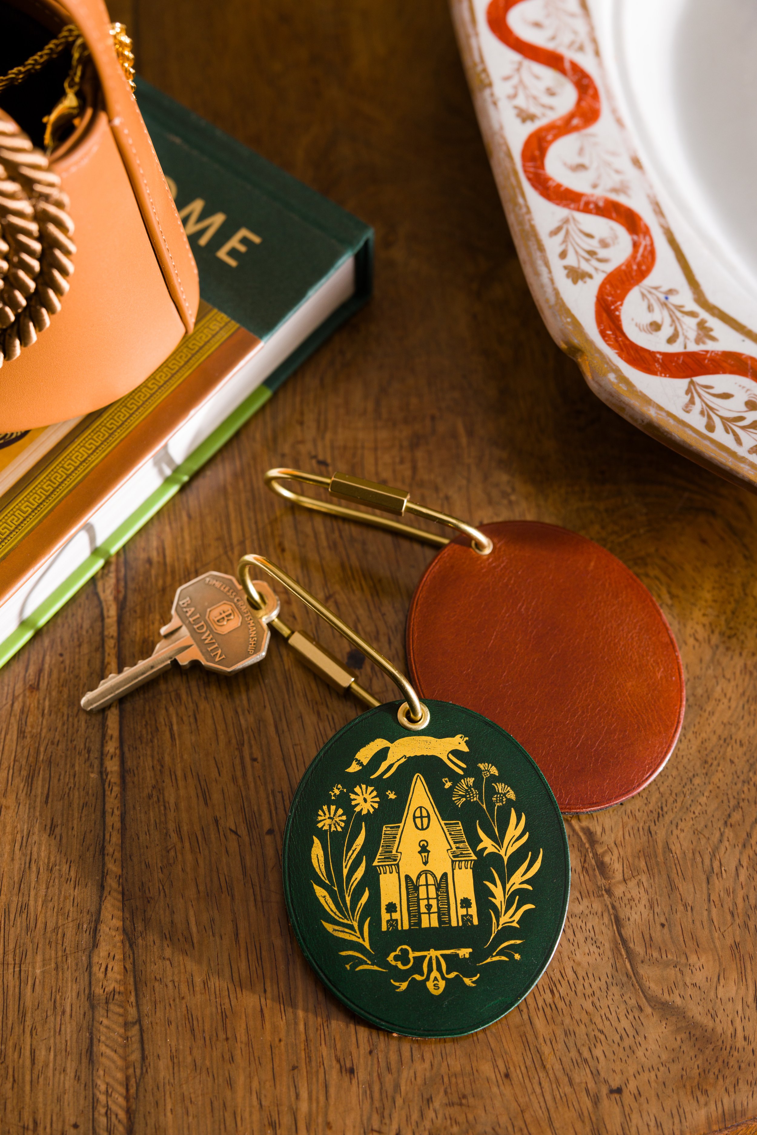
The creative journey began with the exploration of iconic Birmingham homes Allison has always admired. This research provided a foundation to ensure the logo resonated with her industry and audience while capturing the personal nature of her services. Delving into the meaning of Allison’s name and her personal inspirations revealed a love for nature and the outdoors. The discovery that her surname means “dweller by the woods” sparked the idea of incorporating a fox, an animal symbolizing a woodland dweller, into the brand mark.
Additionally, I investigated other elements significant to Allison, such as her affinity for nature and the aesthetic qualities she values. This research phase was crucial in shaping a brand identity that would not only be visually appealing but also deeply personal and meaningful to Allison.
the identity
The final brand identity for Allison Shaw Real Estate features a distinctive hand-drawn illustration that seamlessly blends elements of the real estate industry with Allison’s boutique service approach. The use of green as a primary color reflects Allison’s aesthetic preferences and complements the look of her real estate office. The fox, with its special meaning to Allison, became a central element of the logo, embodying the connection to her surname and love for nature.
In addition to the fox, I incorporated thistles, symbolizing her English and Scottish heritage, and daisies, Allison’s favorite flower. These elements combined to create a unique and recognizable brand mark that not only stands out in the market but also tells a personal story, reflecting Allison’s dedication to her clients and her desire to elevate the real estate experience.


deliverables
Visual Identity
Stationery
Signage
credits
Mary Margaret Smith, photography
Kathleen Varner, styling
kind words
“I knew for years the dream would be to have Holly do my branding. When she agreed to work on it, I was ecstatic! My expectations were high, as I know her caliber of work. I was absolutely blown away with not only the end result but the process! Her explanation of the process was thorough and left no room for questions. I had a hard time knowing exactly what I wanting in my branding, but Holly was able to discern my goals through targeted questions. She met every deadline and the end result truly blew my mind! I am so very proud of my branding and how it sets me apart in an business where most branding looks similar. The value this has brought to my business is incredible! I am truly so thankful to have been able to work with Holly!” Allison Shaw

