

mary and wilma
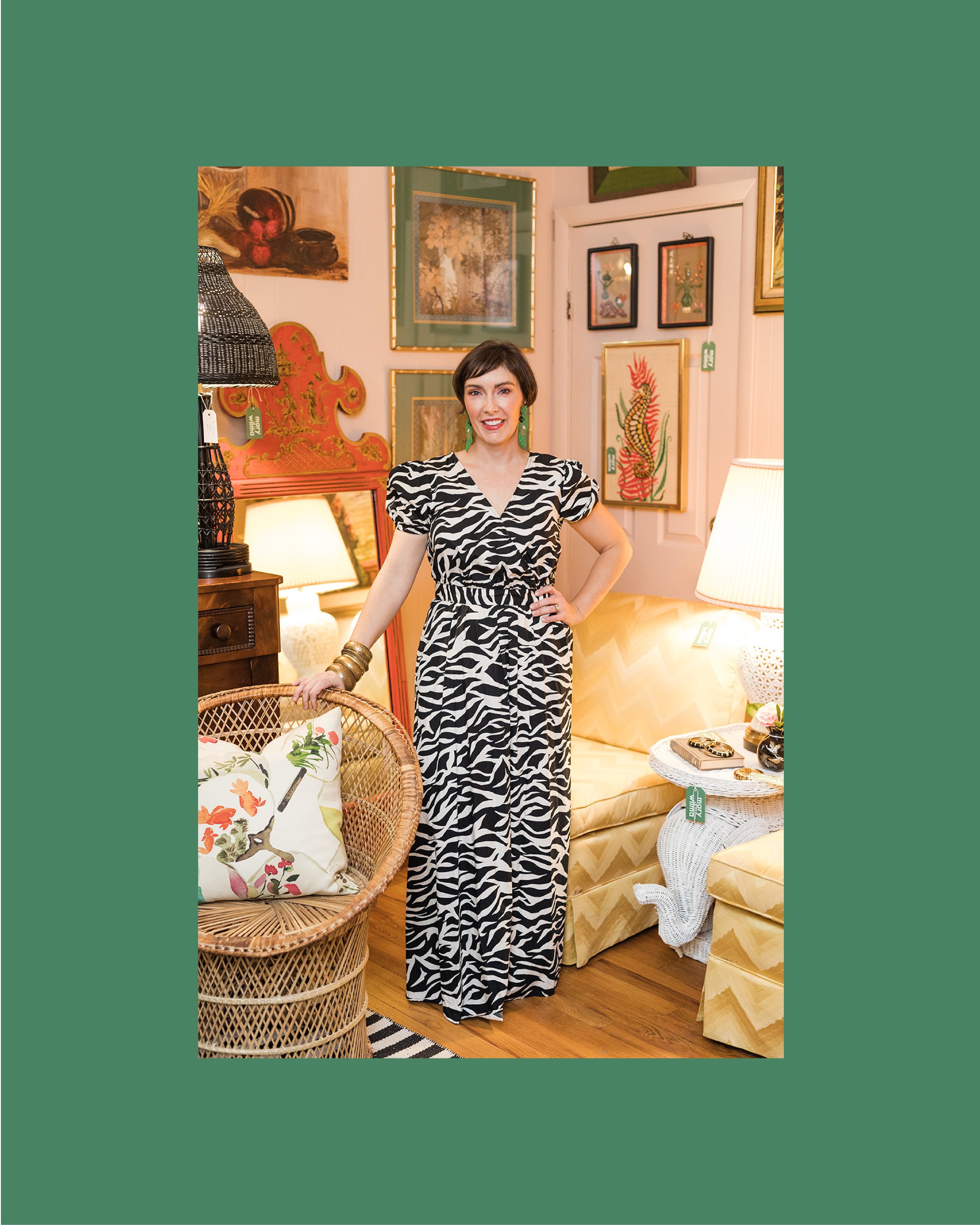
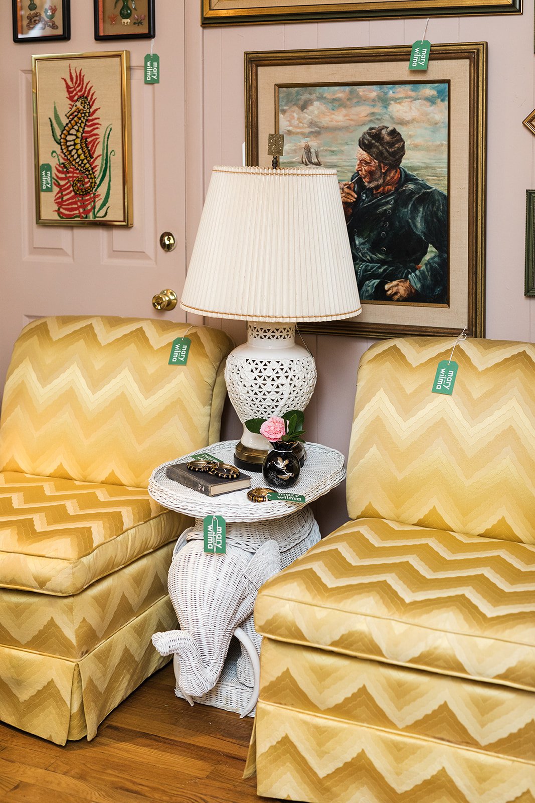
Mary and Wilma is a curated collection of antique, vintage, and eclectic finds that embodies the vibrant spirit of Beth Hubrich's grandmothers, Mary and Wilma. Inspired by Mary’s love for animal prints, the color green and Wilma’s eclectic and adventurous nature, Beth has created a collection that brings these cherished memories to life. Every piece in the collection is hand-picked to fill your home with the vibrance and flair that defined Mary and Wilma.
Beth desired her brand to establish an instant personal connection with her audience. She envisioned a clean, easily recognizable brand that immediately communicates its purpose. The vision for Mary and Wilma was to create a brand that reflects Beth’s Floridian roots, showcasing the colors green and blue, along with elements like leopard print and bamboo. The brand needed to convey the warmth and character of her grandmothers while also highlighting the uniqueness and vibrancy of each curated piece.
The creative process
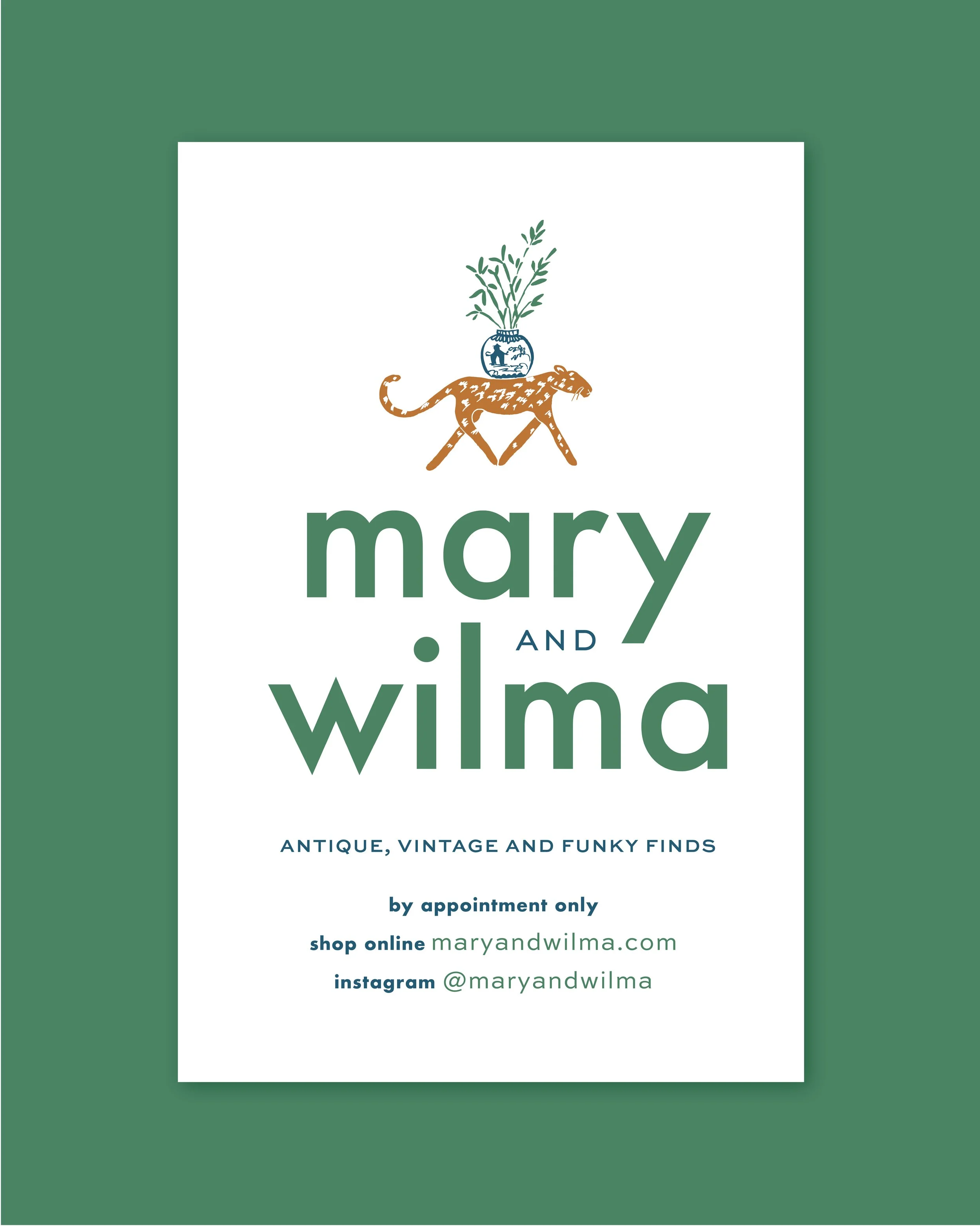
The creative process for Mary and Wilma began with a deep exploration of all things antique, vintage and funky. Beth’s grandmothers inspired the vision for a brand that feels deeply personal and authentic. The design journey focused on incorporating Beth’s favorite elements—green, bamboo, and leopard print—along with her love for chinoiserie. The ginger jar emerged as a key icon, representing vintage and antique finds.
The Identity
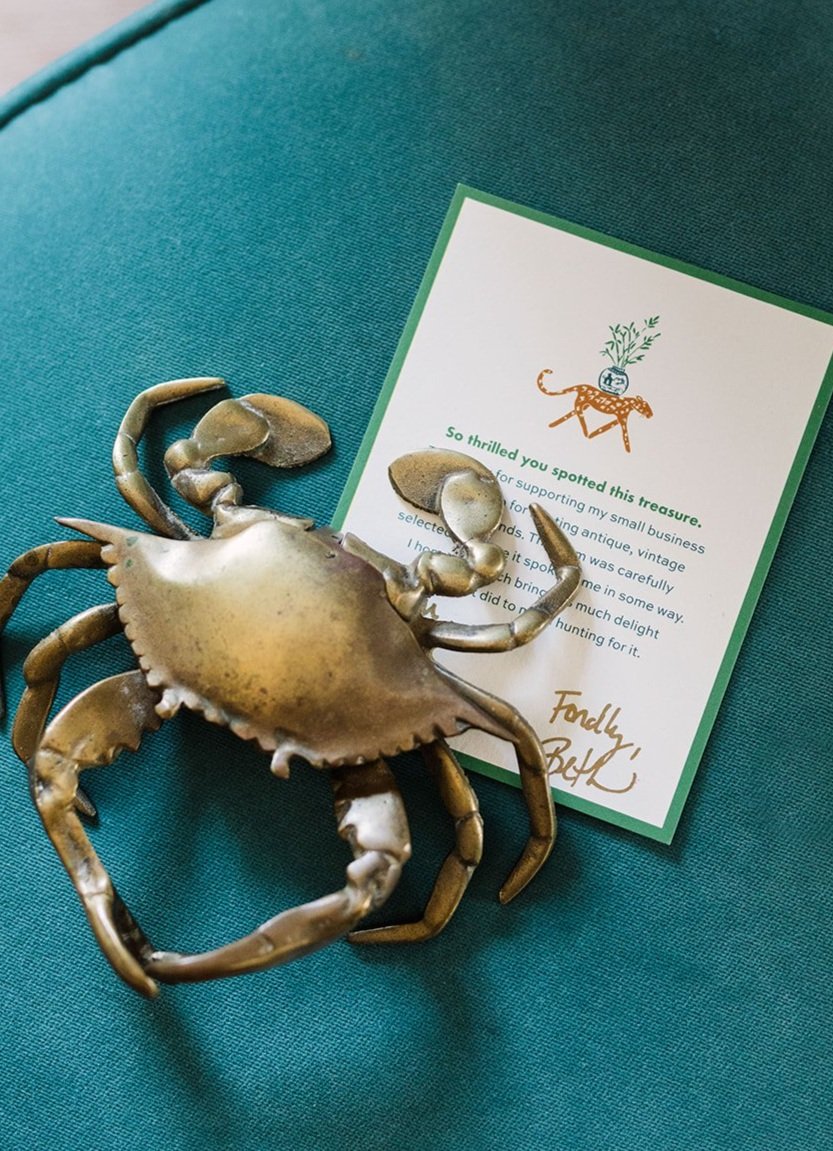
Drawing inspiration from Matisse and mid-century illustration, the creative process brought to life the unique and fun aspects of the brand. The leopard illustration, symbolizing a treasure hunt, became a central element, with its legs cleverly forming an 'M'. This playful approach continued with a series of animals, each showcasing their own finds. Collaboration with Beth revealed her preference for modern and bold typography, leading to a versatile logotype that could stand alone or be paired with the illustrations.
The bold illustration style, paired with modern typography, creates a contemporary yet nostalgic feel. The color palette, rich in green, blue, and pink, pays homage to Beth’s Floridian heritage and her grandmothers' influence. The identity exudes a sense of fun, adventure, and timeless charm, perfectly encapsulating the spirit of Mary and Wilma.

Deliverables
Visual Identity
Printed Collateral
Packaging
Website
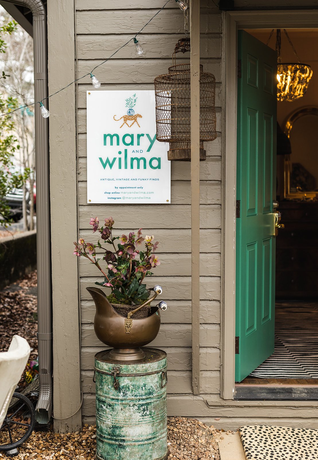
Signage
Credits
Mary Margaret Smith, photography
kind words
“ Working with Holly was a dream come true and I truly believe my business would not be what it is today without her branding. I was completely blown away by the attention to detail and how she really understands the personal nature of my brand. From our discussions/meetings to the first questionnaire that I received, Holly left no stone unturned so that she had the full picture and in depth knowledge of the how and why behind my company. Not only did she help my brand stand out from others, but I was also so impressed with how she thought through my brand's future needs. Holly is a breath of fresh air and considered things that never crossed my mind. She influenced and helped build not only my logo but also my social media branding, web site, correspondence cards and packaging. She really touched all facets of the business. I cannot imagine ever working with someone more thorough, talented and knowledgeable than Holly. I am incredibly grateful to Holly for pulling out the ideas in my head (in a way only she can do) and making them come to life in a way that truly expresses what my brand is all about.” Beth Hubrich

